如何使用纯 CSS 实现活动侧边栏项目的向外曲线
How do I achieve outward curve for active sidebar item using pure CSS
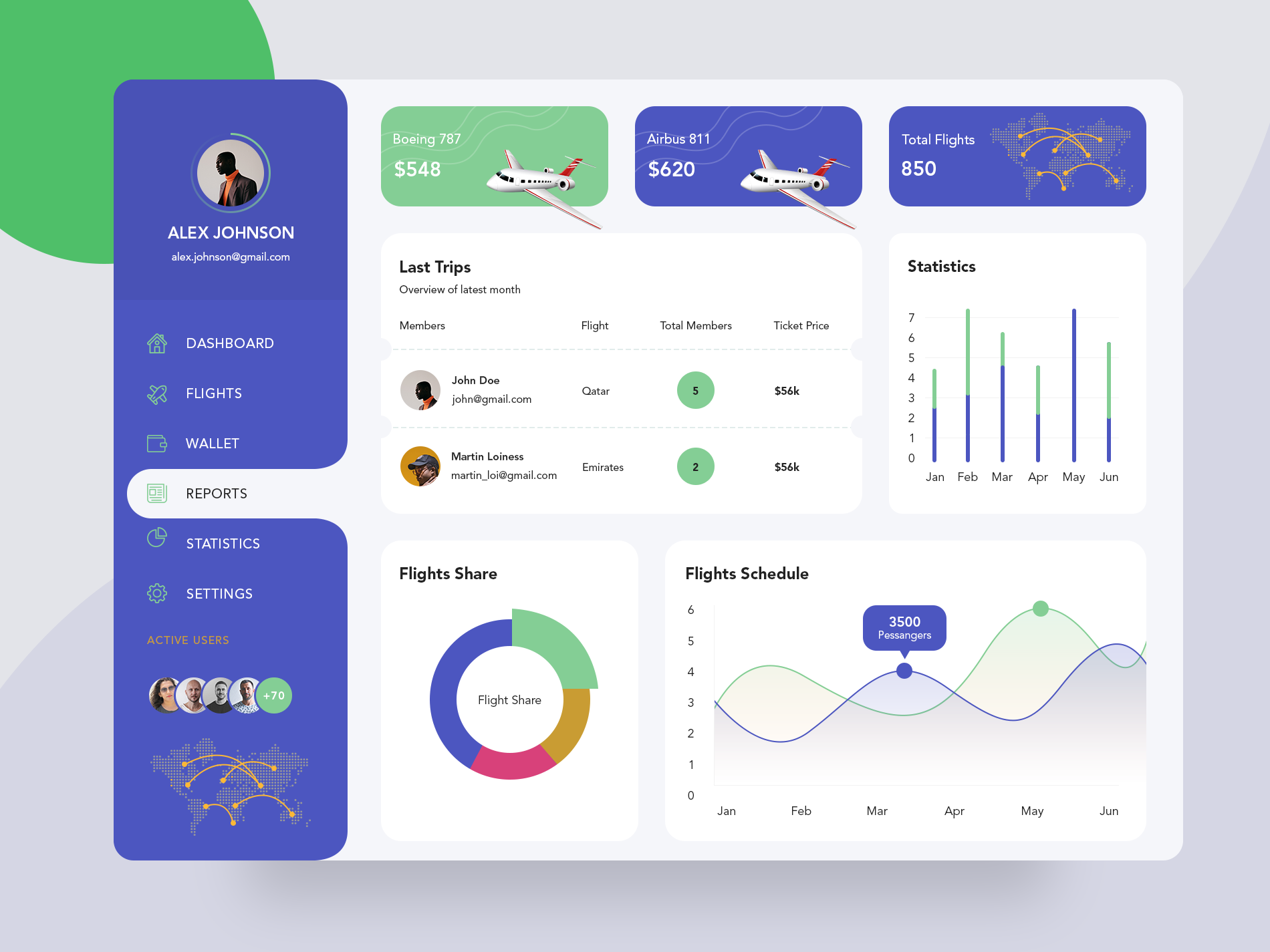
过去一周我一直在学习前端设计,我试图复制我在 dribble 上看到的设计,但由于向外弯曲,我一直很难复制侧边栏上的活动样式。
如果有人能帮助我解决如何实现它,我会很高兴。
除了活动侧边栏项目上的向外曲线,我已经能够实现其他东西。
我无法post一张图片,因为我的声誉不到10所以我在设计中添加了一个link
https://cdn.dribbble.com/users/1192538/screenshots/6973301/flight_web1.png
我很快找到的替代方法是在我的代码中创建一个像 .hover-top-white 的白色正方形,然后在白色上添加具有相同背景颜色的四分之一圆 div 以模拟 de 曲线.见代码:
.menu {
 background-color: purple;
 width: 400px;
 height: 100vh;
 border-radius: 0 50px 50px 0;
 position: relative;
}
.hover {
 width: 350px;
 height: 100px;
 position: absolute;
 right: 0;
 top: 120px;
 display: flex;
 justify-content: flex-end;
}
.hover-top-cut {
 width: 50px;
 height: 50px;
 background-color: purple;
 border-radius: 0 0 50px;
 position: absolute;
 top: -50px;
 rihgt: 0;
 z-index: 3;
}
.hover-top-white {
 width: 50px;
 height: 50px;
 background-color: white;
 position: absolute;
 top: -50px;
 rihgt: 0;
}
.hover-mid {
 width: 100%;
 height: 60%;
 background-color: white;
 border-radius: 50px 0 0 50px;
}
.hover-bottom-cut {
 width: 50px;
 height: 50px;
 background-color: purple;
 border-radius: 0 50px 0 0;
 position: absolute;
 bottom: -10px;
 rihgt: 0;
 z-index: 3;
}
.hover-bottom-white {
 width: 50px;
 height: 50px;
 background-color: white;
 position: absolute;
 bottom: -10px;
 rihgt: 0;
}
<div class="menu">
 <div class="hover">
  <div class="hover-top-cut"></div>
  <div class="hover-top-white"></div>
  <div class="hover-mid"></div>
  <div class="hover-bottom-cut"></div>
  <div class="hover-bottom-white"></div>
 </div>
</div>
当然,您可以使用一些不同的方式来对齐而不是 flexbox 和绝对定位。但我只关注他的曲线。
棘手的部分是右边的 "inverted" 个角。这可以通过 :before 和 :after 元素中的径向渐变背景来解决。
径向渐变通常用于从一种颜色逐渐过渡到另一种颜色。但是,我们可以通过在这种情况下在白色和蓝色之间有一条 "sharp" 线的方式来操纵它。为此,您要确保蓝色和白色的 px 值非常接近。
background: radial-gradient(circle at top left, blue 10px, white 11px);
我在此处对 :hover 状态进行了处理,但您可以将 class 添加到您的活动列表项并在其中进行处理。
.menu{
  list-style-type: none;
  background: blue;
  width: 200px;
  border-radius: 20px;
  padding: 30px 0 30px 30px;
}

.menu li{
  position: relative;
  padding: 5px;
  border-radius: 10px 0 0 10px;
}

.menu li:hover{
  background: white;
}

.menu li:hover:after,
.menu li:hover:before{
  content:'';
  position: absolute;
  width: 10px;
  height: 10px;
  right: 0px;
}

.menu li:hover:after{
  top: -10px;
  background: radial-gradient(circle at top left, blue 10px, white 11px);
}

.menu li:hover:before{
  bottom: -10px;
  background: radial-gradient(circle at bottom left, blue 10px, white 11px);
}
Hover over menu items to see the effect
<ul class="menu">
  <li>one</li>
  <li>two</li>
  <li>three</li>
  <li>four</li>
  <li>five</li>
</ul>
过去一周我一直在学习前端设计,我试图复制我在 dribble 上看到的设计,但由于向外弯曲,我一直很难复制侧边栏上的活动样式。
如果有人能帮助我解决如何实现它,我会很高兴。
除了活动侧边栏项目上的向外曲线,我已经能够实现其他东西。
我无法post一张图片,因为我的声誉不到10所以我在设计中添加了一个link
https://cdn.dribbble.com/users/1192538/screenshots/6973301/flight_web1.png
我很快找到的替代方法是在我的代码中创建一个像 .hover-top-white 的白色正方形,然后在白色上添加具有相同背景颜色的四分之一圆 div 以模拟 de 曲线.见代码:
.menu {
background-color: purple;
width: 400px;
height: 100vh;
border-radius: 0 50px 50px 0;
position: relative;
}
.hover {
width: 350px;
height: 100px;
position: absolute;
right: 0;
top: 120px;
display: flex;
justify-content: flex-end;
}
.hover-top-cut {
width: 50px;
height: 50px;
background-color: purple;
border-radius: 0 0 50px;
position: absolute;
top: -50px;
rihgt: 0;
z-index: 3;
}
.hover-top-white {
width: 50px;
height: 50px;
background-color: white;
position: absolute;
top: -50px;
rihgt: 0;
}
.hover-mid {
width: 100%;
height: 60%;
background-color: white;
border-radius: 50px 0 0 50px;
}
.hover-bottom-cut {
width: 50px;
height: 50px;
background-color: purple;
border-radius: 0 50px 0 0;
position: absolute;
bottom: -10px;
rihgt: 0;
z-index: 3;
}
.hover-bottom-white {
width: 50px;
height: 50px;
background-color: white;
position: absolute;
bottom: -10px;
rihgt: 0;
}
<div class="menu">
<div class="hover">
<div class="hover-top-cut"></div>
<div class="hover-top-white"></div>
<div class="hover-mid"></div>
<div class="hover-bottom-cut"></div>
<div class="hover-bottom-white"></div>
</div>
</div>
当然,您可以使用一些不同的方式来对齐而不是 flexbox 和绝对定位。但我只关注他的曲线。
棘手的部分是右边的 "inverted" 个角。这可以通过 :before 和 :after 元素中的径向渐变背景来解决。
径向渐变通常用于从一种颜色逐渐过渡到另一种颜色。但是,我们可以通过在这种情况下在白色和蓝色之间有一条 "sharp" 线的方式来操纵它。为此,您要确保蓝色和白色的 px 值非常接近。
background: radial-gradient(circle at top left, blue 10px, white 11px);
我在此处对 :hover 状态进行了处理,但您可以将 class 添加到您的活动列表项并在其中进行处理。
.menu{
list-style-type: none;
background: blue;
width: 200px;
border-radius: 20px;
padding: 30px 0 30px 30px;
}
.menu li{
position: relative;
padding: 5px;
border-radius: 10px 0 0 10px;
}
.menu li:hover{
background: white;
}
.menu li:hover:after,
.menu li:hover:before{
content:'';
position: absolute;
width: 10px;
height: 10px;
right: 0px;
}
.menu li:hover:after{
top: -10px;
background: radial-gradient(circle at top left, blue 10px, white 11px);
}
.menu li:hover:before{
bottom: -10px;
background: radial-gradient(circle at bottom left, blue 10px, white 11px);
}
Hover over menu items to see the effect
<ul class="menu">
<li>one</li>
<li>two</li>
<li>three</li>
<li>four</li>
<li>five</li>
</ul>