col-sm-4 不适合三列
col-sm-4 not fitting three columns
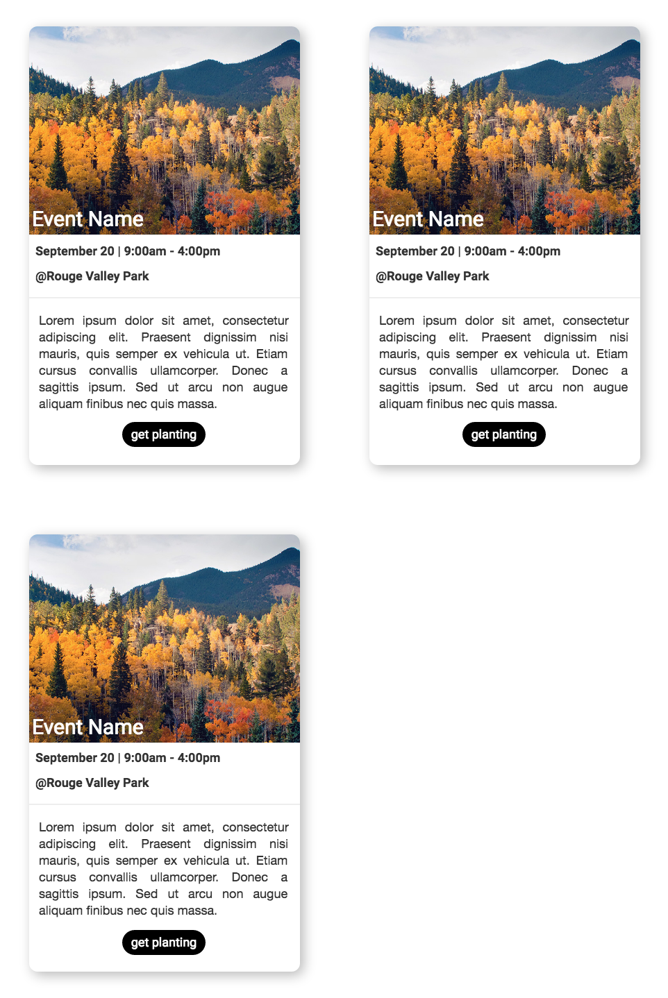
当我使用 col-sm-4 时,只有两列适合。即使我以最大程度缩小查看网页时也会发生这种情况。显示两列而不是三列。我试图编辑边距,但这没有帮助。 Here is how it looks. 这看起来很业余,其实我是业余的。谢谢
HTML
<section class="container">
  <div class="eventDisplay">
    <h2>Available Events</h2>
    <div class="eventDisplay row">

      <div class="eventDisplay col-sm-4">
        <div class="thumb">
          <span>Event Name</span>
        </div>

        <h2 style="font-weight: bold;">September 20 | 9:00am - 4:00pm <br/><br/> @Rouge Valley Park</h2>
        <hr>
        <p>
          Lorem ipsum dolor sit amet, consectetur adipiscing elit. Praesent dignissim nisi mauris, quis semper ex vehicula ut. Etiam cursus convallis ullamcorper. Donec a sagittis ipsum. Sed ut arcu non augue aliquam finibus nec quis massa.
        </p>

        <div class="centerButton">
          <a class="btn btn-secondary" href="mailto:tempEmail?Subject=Event Title &body=Name:">get planting</a>
        </div>
      </div>

      (this time 3)

    </div>
  </div>
</section>
CSS
.eventdisplay.row {
  margin: 30px;
}

.eventDisplay.col-sm-4 {
  margin: 50px;
  border-radius: 12px;
  box-shadow: 5px 5px 25px #B8B8B8;
  padding: 0 !important;
}

.thumb {
  -webkit-border-top-right-radius: 12px;
  -webkit-border-top-left-radius: 12px;
  display: block;
  background-image: url("img/trees.jpg");
  background-size: cover;
  height: 300px;
  width: 100%;
  position: relative;
}
检查这个:
- 删除任何边距
- 在任何行之前添加 div 和 class
row 在你的情况下将三个 col-sm-4 放在 div 和 class row
- 将此添加到所有元素
box-sizing: border-box;
至少我是这样看的:出于某种原因,您将 class、.eventDisplay 嵌套了 3 层,并试图将它与 .row 结合使用或 .col-*-* 破坏了那些 classes 的属性并导致网格破裂。作为一个非常普遍的规则,将您的内容放在网格中
.container
  .row
    .col-*-*
      .content
这里有两个示例:一个清理您当前的代码,另一个使用修改后的 Card Component。
示例 1:您所拥有的排序。
.eventDisplay {
  border-radius: 12px;
  box-shadow: 5px 5px 25px #B8B8B8;
}
.thumb {
  -webkit-border-top-right-radius: 12px;
  -webkit-border-top-left-radius: 12px;
  background-image: url("http://placehold.it/350x150");
  background-repeat: no-repeat;
  background-position: center;
  background-size: cover;
  width: 100%;
  height: 150px;
}
<link href="https://maxcdn.bootstrapcdn.com/bootstrap/4.0.0-alpha.2/css/bootstrap.min.css" rel="stylesheet" />
<section class="container">
  <div class="row">

    <div class="col-sm-4">

      <div class="eventDisplay">
        <div class="thumb">
          <span>Event Name</span>
        </div>
        <h2>Available Events</h2>
        <h2>September 20 | 9:00am - 4:00pm <br/><br/> @Rouge Valley Park</h2>
        <hr>
        <p>Lorem ipsum dolor sit amet, consectetur adipiscing elit. Praesent dignissim nisi mauris, quis semper ex vehicula ut. Etiam cursus convallis ullamcorper. Donec a sagittis ipsum. Sed ut arcu non augue aliquam finibus nec quis massa.</p>
        <div class="centerButton">
          <a class="btn btn-secondary" href="mailto:tempEmail?Subject=Event Title &body=Name:">get planting</a>
        </div>
      </div>

    </div>

  </div>
</section>
示例 2:使用 Bootstrap v4 卡片。
body {
  padding-top: 50px;
}
.card.eventDisplay {
  box-shadow: .25rem .25rem 1.75rem #B8B8B8;
  border: none;
}
.btn.btn-black {
  background: #000;
  color: white;
  border-radius: 2.5rem;
}
.card-img.card-img-bottom {
  border-radius: .25rem .25rem 0 0;
}
@media (min-width: 48em) and (max-width: 61em) {
  .event:nth-child(2n+1) {
    clear: left;
  }
}
@media (min-width: 62em) {
  .event:nth-child(3n+1) {
    clear: left;
  }
}
<link href="https://maxcdn.bootstrapcdn.com/bootstrap/4.0.0-alpha.2/css/bootstrap.min.css" rel="stylesheet" />
<section class="container">
  <div class="row">

    <div class="col-lg-4 col-md-6 event">

      <div class="card eventDisplay">
        <img class="card-img card-img-bottom img-fluid" src="http://placehold.it/750x500" alt="alt">
        <div class="card-img-overlay">
          <h4 class="card-title">Event 1</h4>
        </div>
        <ul class="list-group list-group-flush">
          <li class="list-group-item">September 20 | 9:00am - 4:00pm</li>
          <li class="list-group-item">@Rouge Valley Park</li>
        </ul>
        <div class="card-block text-xs-center">
          <p class="card-text">Some quick example text to build on the card title and make up the bulk of the card's content.</p>
          <a href="#" class="btn btn-secondary btn-black">Get Planning</a>
        </div>
      </div>

    </div>

    <div class="col-lg-4 col-md-6 event">

      <div class="card eventDisplay">
        <img class="card-img card-img-bottom img-fluid" src="http://placehold.it/750x500" alt="alt">
        <div class="card-img-overlay">
          <h4 class="card-title">Event 2</h4>
        </div>
        <ul class="list-group list-group-flush">
          <li class="list-group-item">September 20 | 9:00am - 4:00pm</li>
          <li class="list-group-item">@Rouge Valley Park</li>
        </ul>
        <div class="card-block text-xs-center">
          <p class="card-text">Some quick example text to build on the card title and make up the bulk of the card's content. Some quick example text to build on the card title and make up the bulk of the card's content.</p>
          <a href="#" class="btn btn-secondary btn-black">Get Planning</a>
        </div>
      </div>

    </div>

    <div class="col-lg-4 col-md-6 event">

      <div class="card eventDisplay">
        <img class="card-img card-img-bottom img-fluid" src="http://placehold.it/750x500" alt="alt">
        <div class="card-img-overlay">
          <h4 class="card-title">Event 3</h4>
        </div>
        <ul class="list-group list-group-flush">
          <li class="list-group-item">September 20 | 9:00am - 4:00pm</li>
          <li class="list-group-item">@Rouge Valley Park</li>
        </ul>
        <div class="card-block text-xs-center">
          <p class="card-text">Some quick example text to build on the card title and make up the bulk of the card's content. Some quick example text to build on the card title and make up the bulk of the card's content. Some quick example text to build on the card title
            and make up the bulk of the card's content.</p>
          <a href="#" class="btn btn-secondary btn-black">Get Planning</a>
        </div>
      </div>

    </div>

    <div class="col-lg-4 col-md-6 event">

      <div class="card eventDisplay">
        <img class="card-img card-img-bottom img-fluid" src="http://placehold.it/750x500" alt="alt">
        <div class="card-img-overlay">
          <h4 class="card-title">Event 4</h4>
        </div>
        <ul class="list-group list-group-flush">
          <li class="list-group-item">September 20 | 9:00am - 4:00pm</li>
          <li class="list-group-item">@Rouge Valley Park</li>
        </ul>
        <div class="card-block text-xs-center">
          <p class="card-text">Some quick example text to build on the card title and make up the bulk of the card's content. Some quick example text to build on the card title and make up the bulk of the card's content.</p>
          <a href="#" class="btn btn-secondary btn-black">Get Planning</a>
        </div>
      </div>

    </div>

    <div class="col-lg-4 col-md-6 event">

      <div class="card eventDisplay">
        <img class="card-img card-img-bottom img-fluid" src="http://placehold.it/750x500" alt="alt">
        <div class="card-img-overlay">
          <h4 class="card-title">Event 5</h4>
        </div>
        <ul class="list-group list-group-flush">
          <li class="list-group-item">September 20 | 9:00am - 4:00pm</li>
          <li class="list-group-item">@Rouge Valley Park</li>
        </ul>
        <div class="card-block text-xs-center">
          <p class="card-text">Some quick example text to build on the card title and make up the bulk of the card's content. Some quick example text to build on the card title and make up the bulk of the card's content. Some quick example text to build on the card title
            and make up the bulk of the card's content.</p>
          <a href="#" class="btn btn-secondary btn-black">Get Planning</a>
        </div>
      </div>

    </div>

    <div class="col-lg-4 col-md-6 event">

      <div class="card eventDisplay">
        <img class="card-img card-img-bottom img-fluid" src="http://placehold.it/750x500" alt="alt">
        <div class="card-img-overlay">
          <h4 class="card-title">Event 6</h4>
        </div>
        <ul class="list-group list-group-flush">
          <li class="list-group-item">September 20 | 9:00am - 4:00pm</li>
          <li class="list-group-item">@Rouge Valley Park</li>
        </ul>
        <div class="card-block text-xs-center">
          <p class="card-text">Some quick example text to build on the card title and make up the bulk of the card's content.</p>
          <a href="#" class="btn btn-secondary btn-black">Get Planning</a>
        </div>
      </div>

    </div>

    <div class="col-lg-4 col-md-6 event">

      <div class="card eventDisplay">
        <img class="card-img card-img-bottom img-fluid" src="http://placehold.it/750x500" alt="alt">
        <div class="card-img-overlay">
          <h4 class="card-title">Event 7</h4>
        </div>
        <ul class="list-group list-group-flush">
          <li class="list-group-item">September 20 | 9:00am - 4:00pm</li>
          <li class="list-group-item">@Rouge Valley Park</li>
        </ul>
        <div class="card-block text-xs-center">
          <p class="card-text">Some quick example text to build on the card title and make up the bulk of the card's content. Some quick example text to build on the card title and make up the bulk of the card's content.</p>
          <a href="#" class="btn btn-secondary btn-black">Get Planning</a>
        </div>
      </div>

    </div>

    <div class="col-lg-4 col-md-6 event">

      <div class="card eventDisplay">
        <img class="card-img card-img-bottom img-fluid" src="http://placehold.it/750x500" alt="alt">
        <div class="card-img-overlay">
          <h4 class="card-title">Event 8</h4>
        </div>
        <ul class="list-group list-group-flush">
          <li class="list-group-item">September 20 | 9:00am - 4:00pm</li>
          <li class="list-group-item">@Rouge Valley Park</li>
        </ul>
        <div class="card-block text-xs-center">
          <p class="card-text">Some quick example text to build on the card title and make up the bulk of the card's content. Some quick example text to build on the card title and make up the bulk of the card's content. Some quick example text to build on the card title
            and make up the bulk of the card's content.</p>
          <a href="#" class="btn btn-secondary btn-black">Get Planning</a>
        </div>
      </div>

    </div>

    <div class="col-lg-4 col-md-6 event">

      <div class="card eventDisplay">
        <img class="card-img card-img-bottom img-fluid" src="http://placehold.it/750x500" alt="alt">
        <div class="card-img-overlay">
          <h4 class="card-title">Event 9</h4>
        </div>
        <ul class="list-group list-group-flush">
          <li class="list-group-item">September 20 | 9:00am - 4:00pm</li>
          <li class="list-group-item">@Rouge Valley Park</li>
        </ul>
        <div class="card-block text-xs-center">
          <p class="card-text">Some quick example text to build on the card title and make up the bulk of the card's content. Some quick example text to build on the card title and make up the bulk of the card's content.</p>
          <a href="#" class="btn btn-secondary btn-black">Get Planning</a>
        </div>
      </div>

    </div>

    <div class="col-lg-4 col-md-6 event">

      <div class="card eventDisplay">
        <img class="card-img card-img-bottom img-fluid" src="http://placehold.it/750x500" alt="alt">
        <div class="card-img-overlay">
          <h4 class="card-title">Event 10</h4>
        </div>
        <ul class="list-group list-group-flush">
          <li class="list-group-item">September 20 | 9:00am - 4:00pm</li>
          <li class="list-group-item">@Rouge Valley Park</li>
        </ul>
        <div class="card-block text-xs-center">
          <p class="card-text">Some quick example text to build on the card title and make up the bulk of the card's content. Some quick example text to build on the card title and make up the bulk of the card's content. Some quick example text to build on the card title
            and make up the bulk of the card's content.</p>
          <a href="#" class="btn btn-secondary btn-black">Get Planning</a>
        </div>
      </div>

    </div>

  </div>
</section>
当我使用 col-sm-4 时,只有两列适合。即使我以最大程度缩小查看网页时也会发生这种情况。显示两列而不是三列。我试图编辑边距,但这没有帮助。 Here is how it looks. 这看起来很业余,其实我是业余的。谢谢
HTML
<section class="container">
<div class="eventDisplay">
<h2>Available Events</h2>
<div class="eventDisplay row">
<div class="eventDisplay col-sm-4">
<div class="thumb">
<span>Event Name</span>
</div>
<h2 style="font-weight: bold;">September 20 | 9:00am - 4:00pm <br/><br/> @Rouge Valley Park</h2>
<hr>
<p>
Lorem ipsum dolor sit amet, consectetur adipiscing elit. Praesent dignissim nisi mauris, quis semper ex vehicula ut. Etiam cursus convallis ullamcorper. Donec a sagittis ipsum. Sed ut arcu non augue aliquam finibus nec quis massa.
</p>
<div class="centerButton">
<a class="btn btn-secondary" href="mailto:tempEmail?Subject=Event Title &body=Name:">get planting</a>
</div>
</div>
(this time 3)
</div>
</div>
</section>
CSS
.eventdisplay.row {
margin: 30px;
}
.eventDisplay.col-sm-4 {
margin: 50px;
border-radius: 12px;
box-shadow: 5px 5px 25px #B8B8B8;
padding: 0 !important;
}
.thumb {
-webkit-border-top-right-radius: 12px;
-webkit-border-top-left-radius: 12px;
display: block;
background-image: url("img/trees.jpg");
background-size: cover;
height: 300px;
width: 100%;
position: relative;
}
检查这个:
- 删除任何边距
- 在任何行之前添加 div 和 class
row在你的情况下将三个col-sm-4放在div和 classrow - 将此添加到所有元素
box-sizing: border-box;
至少我是这样看的:出于某种原因,您将 class、.eventDisplay 嵌套了 3 层,并试图将它与 .row 结合使用或 .col-*-* 破坏了那些 classes 的属性并导致网格破裂。作为一个非常普遍的规则,将您的内容放在网格中
.container
.row
.col-*-*
.content
这里有两个示例:一个清理您当前的代码,另一个使用修改后的 Card Component。
示例 1:您所拥有的排序。
.eventDisplay {
border-radius: 12px;
box-shadow: 5px 5px 25px #B8B8B8;
}
.thumb {
-webkit-border-top-right-radius: 12px;
-webkit-border-top-left-radius: 12px;
background-image: url("http://placehold.it/350x150");
background-repeat: no-repeat;
background-position: center;
background-size: cover;
width: 100%;
height: 150px;
}
<link href="https://maxcdn.bootstrapcdn.com/bootstrap/4.0.0-alpha.2/css/bootstrap.min.css" rel="stylesheet" />
<section class="container">
<div class="row">
<div class="col-sm-4">
<div class="eventDisplay">
<div class="thumb">
<span>Event Name</span>
</div>
<h2>Available Events</h2>
<h2>September 20 | 9:00am - 4:00pm <br/><br/> @Rouge Valley Park</h2>
<hr>
<p>Lorem ipsum dolor sit amet, consectetur adipiscing elit. Praesent dignissim nisi mauris, quis semper ex vehicula ut. Etiam cursus convallis ullamcorper. Donec a sagittis ipsum. Sed ut arcu non augue aliquam finibus nec quis massa.</p>
<div class="centerButton">
<a class="btn btn-secondary" href="mailto:tempEmail?Subject=Event Title &body=Name:">get planting</a>
</div>
</div>
</div>
</div>
</section>
示例 2:使用 Bootstrap v4 卡片。
body {
padding-top: 50px;
}
.card.eventDisplay {
box-shadow: .25rem .25rem 1.75rem #B8B8B8;
border: none;
}
.btn.btn-black {
background: #000;
color: white;
border-radius: 2.5rem;
}
.card-img.card-img-bottom {
border-radius: .25rem .25rem 0 0;
}
@media (min-width: 48em) and (max-width: 61em) {
.event:nth-child(2n+1) {
clear: left;
}
}
@media (min-width: 62em) {
.event:nth-child(3n+1) {
clear: left;
}
}
<link href="https://maxcdn.bootstrapcdn.com/bootstrap/4.0.0-alpha.2/css/bootstrap.min.css" rel="stylesheet" />
<section class="container">
<div class="row">
<div class="col-lg-4 col-md-6 event">
<div class="card eventDisplay">
<img class="card-img card-img-bottom img-fluid" src="http://placehold.it/750x500" alt="alt">
<div class="card-img-overlay">
<h4 class="card-title">Event 1</h4>
</div>
<ul class="list-group list-group-flush">
<li class="list-group-item">September 20 | 9:00am - 4:00pm</li>
<li class="list-group-item">@Rouge Valley Park</li>
</ul>
<div class="card-block text-xs-center">
<p class="card-text">Some quick example text to build on the card title and make up the bulk of the card's content.</p>
<a href="#" class="btn btn-secondary btn-black">Get Planning</a>
</div>
</div>
</div>
<div class="col-lg-4 col-md-6 event">
<div class="card eventDisplay">
<img class="card-img card-img-bottom img-fluid" src="http://placehold.it/750x500" alt="alt">
<div class="card-img-overlay">
<h4 class="card-title">Event 2</h4>
</div>
<ul class="list-group list-group-flush">
<li class="list-group-item">September 20 | 9:00am - 4:00pm</li>
<li class="list-group-item">@Rouge Valley Park</li>
</ul>
<div class="card-block text-xs-center">
<p class="card-text">Some quick example text to build on the card title and make up the bulk of the card's content. Some quick example text to build on the card title and make up the bulk of the card's content.</p>
<a href="#" class="btn btn-secondary btn-black">Get Planning</a>
</div>
</div>
</div>
<div class="col-lg-4 col-md-6 event">
<div class="card eventDisplay">
<img class="card-img card-img-bottom img-fluid" src="http://placehold.it/750x500" alt="alt">
<div class="card-img-overlay">
<h4 class="card-title">Event 3</h4>
</div>
<ul class="list-group list-group-flush">
<li class="list-group-item">September 20 | 9:00am - 4:00pm</li>
<li class="list-group-item">@Rouge Valley Park</li>
</ul>
<div class="card-block text-xs-center">
<p class="card-text">Some quick example text to build on the card title and make up the bulk of the card's content. Some quick example text to build on the card title and make up the bulk of the card's content. Some quick example text to build on the card title
and make up the bulk of the card's content.</p>
<a href="#" class="btn btn-secondary btn-black">Get Planning</a>
</div>
</div>
</div>
<div class="col-lg-4 col-md-6 event">
<div class="card eventDisplay">
<img class="card-img card-img-bottom img-fluid" src="http://placehold.it/750x500" alt="alt">
<div class="card-img-overlay">
<h4 class="card-title">Event 4</h4>
</div>
<ul class="list-group list-group-flush">
<li class="list-group-item">September 20 | 9:00am - 4:00pm</li>
<li class="list-group-item">@Rouge Valley Park</li>
</ul>
<div class="card-block text-xs-center">
<p class="card-text">Some quick example text to build on the card title and make up the bulk of the card's content. Some quick example text to build on the card title and make up the bulk of the card's content.</p>
<a href="#" class="btn btn-secondary btn-black">Get Planning</a>
</div>
</div>
</div>
<div class="col-lg-4 col-md-6 event">
<div class="card eventDisplay">
<img class="card-img card-img-bottom img-fluid" src="http://placehold.it/750x500" alt="alt">
<div class="card-img-overlay">
<h4 class="card-title">Event 5</h4>
</div>
<ul class="list-group list-group-flush">
<li class="list-group-item">September 20 | 9:00am - 4:00pm</li>
<li class="list-group-item">@Rouge Valley Park</li>
</ul>
<div class="card-block text-xs-center">
<p class="card-text">Some quick example text to build on the card title and make up the bulk of the card's content. Some quick example text to build on the card title and make up the bulk of the card's content. Some quick example text to build on the card title
and make up the bulk of the card's content.</p>
<a href="#" class="btn btn-secondary btn-black">Get Planning</a>
</div>
</div>
</div>
<div class="col-lg-4 col-md-6 event">
<div class="card eventDisplay">
<img class="card-img card-img-bottom img-fluid" src="http://placehold.it/750x500" alt="alt">
<div class="card-img-overlay">
<h4 class="card-title">Event 6</h4>
</div>
<ul class="list-group list-group-flush">
<li class="list-group-item">September 20 | 9:00am - 4:00pm</li>
<li class="list-group-item">@Rouge Valley Park</li>
</ul>
<div class="card-block text-xs-center">
<p class="card-text">Some quick example text to build on the card title and make up the bulk of the card's content.</p>
<a href="#" class="btn btn-secondary btn-black">Get Planning</a>
</div>
</div>
</div>
<div class="col-lg-4 col-md-6 event">
<div class="card eventDisplay">
<img class="card-img card-img-bottom img-fluid" src="http://placehold.it/750x500" alt="alt">
<div class="card-img-overlay">
<h4 class="card-title">Event 7</h4>
</div>
<ul class="list-group list-group-flush">
<li class="list-group-item">September 20 | 9:00am - 4:00pm</li>
<li class="list-group-item">@Rouge Valley Park</li>
</ul>
<div class="card-block text-xs-center">
<p class="card-text">Some quick example text to build on the card title and make up the bulk of the card's content. Some quick example text to build on the card title and make up the bulk of the card's content.</p>
<a href="#" class="btn btn-secondary btn-black">Get Planning</a>
</div>
</div>
</div>
<div class="col-lg-4 col-md-6 event">
<div class="card eventDisplay">
<img class="card-img card-img-bottom img-fluid" src="http://placehold.it/750x500" alt="alt">
<div class="card-img-overlay">
<h4 class="card-title">Event 8</h4>
</div>
<ul class="list-group list-group-flush">
<li class="list-group-item">September 20 | 9:00am - 4:00pm</li>
<li class="list-group-item">@Rouge Valley Park</li>
</ul>
<div class="card-block text-xs-center">
<p class="card-text">Some quick example text to build on the card title and make up the bulk of the card's content. Some quick example text to build on the card title and make up the bulk of the card's content. Some quick example text to build on the card title
and make up the bulk of the card's content.</p>
<a href="#" class="btn btn-secondary btn-black">Get Planning</a>
</div>
</div>
</div>
<div class="col-lg-4 col-md-6 event">
<div class="card eventDisplay">
<img class="card-img card-img-bottom img-fluid" src="http://placehold.it/750x500" alt="alt">
<div class="card-img-overlay">
<h4 class="card-title">Event 9</h4>
</div>
<ul class="list-group list-group-flush">
<li class="list-group-item">September 20 | 9:00am - 4:00pm</li>
<li class="list-group-item">@Rouge Valley Park</li>
</ul>
<div class="card-block text-xs-center">
<p class="card-text">Some quick example text to build on the card title and make up the bulk of the card's content. Some quick example text to build on the card title and make up the bulk of the card's content.</p>
<a href="#" class="btn btn-secondary btn-black">Get Planning</a>
</div>
</div>
</div>
<div class="col-lg-4 col-md-6 event">
<div class="card eventDisplay">
<img class="card-img card-img-bottom img-fluid" src="http://placehold.it/750x500" alt="alt">
<div class="card-img-overlay">
<h4 class="card-title">Event 10</h4>
</div>
<ul class="list-group list-group-flush">
<li class="list-group-item">September 20 | 9:00am - 4:00pm</li>
<li class="list-group-item">@Rouge Valley Park</li>
</ul>
<div class="card-block text-xs-center">
<p class="card-text">Some quick example text to build on the card title and make up the bulk of the card's content. Some quick example text to build on the card title and make up the bulk of the card's content. Some quick example text to build on the card title
and make up the bulk of the card's content.</p>
<a href="#" class="btn btn-secondary btn-black">Get Planning</a>
</div>
</div>
</div>
</div>
</section>