悬停按钮的媒体查询定位问题
Problems on my Media-Queries Positioning for Hover Buttons
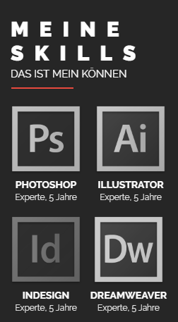
我完成了所有智能手机设备的编码,现在我开始使用平板电脑,但很快在执行此任务时我遇到了问题,因为我不确定如何解决这个问题。
这是我的 "Section Skills" 在手机上的样子:
My section on mobile
在平板电脑上,我希望每行 3 个而不是 2 个,但我无法做到这一点,也不知道为什么。
.Skills{
 background-color:#262626;
 padding-bottom: 40px;
}


.Skills p:nth-child(1){
 padding-top: 54px;
 padding-left: 50px;
 font-size:30px;
 font-weight:900;
 letter-spacing: 15px;
 color:#fff;
}

.Skills p:nth-child(2){
 padding-top: 4px;
 padding-left: 50px;
 font-size:30px;
 font-weight:900;
 letter-spacing: 15px;
 color:#fff;
}

.Skills p:nth-child(3){
 padding-top: 7px;
 padding-left: 50px;
 font-size:15px;
 font-weight:400;
 color:#fff;
}

.Skills img:nth-child(4){
 padding-top: 7px;
 padding-left: 51px;
}

section {
 display:flex;
 flex-wrap: wrap;
 flex-direction:row;
  justify-content: space-between;
}

.Programme {
 text-align:center;
 color:#ffffff;
    padding: 20px 0 0 49px;

}

section .Programme:nth-child(2),section .Programme:nth-child(4),section .Programme:nth-child(6),section .Programme:nth-child(8) {
    padding: 20px 49px 0 0;
}

.Programme img {
 -webkit-filter: grayscale(100%);
    filter: grayscale(100%);
 transition: filter 1s ease;
    transition : -webkit-filter 1000ms linear;
    width: 102px;
}

.Programme img:hover {
 -webkit-filter: grayscale(0%);
    filter: grayscale(0%);
 transition: filter 1s ease;
    transition : -webkit-filter 1000ms linear
}

h3{
 margin: 5px 0 0 0;
    font-size: 14px;
 font-weight:700;
}

h4 {
 margin: 5px 0 0 0;
    font-size: 12px;
 font-weight: 300;
}
<article class="Skills">
        <p>MEINE</p>
        <p>SKILLS</p>
        <p>DAS IST MEIN KÖNNEN</p>
        <img src="images/Strich_320.jpg" alt=""/>

        <section>

            <div class="Programme">
                <img src="images/Photoshop.png"/>
                <h3>PHOTOSHOP</h3>
                <h4>Experte, 5 Jahre</h4>
            </div>

            <div class="Programme">
                <img src="images/Illustrator.png"/>
                <h3>ILLUSTRATOR</h3>
                <h4>Experte, 5 Jahre</h4>
            </div>

            <div class="Programme">
                <img src="images/InDesign.png"/>
                <h3>INDESIGN</h3>
                <h4>Experte, 5 Jahre</h4>
            </div>

            <div class="Programme">
                <img src="images/Dreamweaver.png"/>
                <h3>DREAMWEAVER</h3>
                <h4>Experte, 5 Jahre</h4>
            </div>

            <div class="Programme">
                <img src="images/AfterEffects.png"/>
                <h3>AFTEREFFECTS</h3>
                <h4>Experte, 5 Jahre</h4>
            </div>

            <div class="Programme">
                <img src="images/PremierePro.png"/>
                <h3>PREMIERE PRO</h3>
                <h4>Experte, 5 Jahre</h4>
            </div>

            <div class="Programme">
                <img src="images/SonyVegas.png"/>
                <h3>SONY VEGAS</h3>
                <h4>Experte, 5 Jahre</h4>
            </div>

            <div class="Programme">
                <img src="images/Cinema4D.png"/>
                <h3>CINEMA4D</h3>
                <h4>Experte, 5 Jahre</h4>
            </div>
        </section>
    </article>
这很难说,但听起来很像其中一个父容器(section 或 article)太窄而且一旦水平 padding被考虑在内,.programme divs 太宽而无法连续放置 3 个。
尝试:
.programme {
max-width: 20%;
}
我完成了所有智能手机设备的编码,现在我开始使用平板电脑,但很快在执行此任务时我遇到了问题,因为我不确定如何解决这个问题。
这是我的 "Section Skills" 在手机上的样子: My section on mobile
在平板电脑上,我希望每行 3 个而不是 2 个,但我无法做到这一点,也不知道为什么。
.Skills{
background-color:#262626;
padding-bottom: 40px;
}
.Skills p:nth-child(1){
padding-top: 54px;
padding-left: 50px;
font-size:30px;
font-weight:900;
letter-spacing: 15px;
color:#fff;
}
.Skills p:nth-child(2){
padding-top: 4px;
padding-left: 50px;
font-size:30px;
font-weight:900;
letter-spacing: 15px;
color:#fff;
}
.Skills p:nth-child(3){
padding-top: 7px;
padding-left: 50px;
font-size:15px;
font-weight:400;
color:#fff;
}
.Skills img:nth-child(4){
padding-top: 7px;
padding-left: 51px;
}
section {
display:flex;
flex-wrap: wrap;
flex-direction:row;
justify-content: space-between;
}
.Programme {
text-align:center;
color:#ffffff;
padding: 20px 0 0 49px;
}
section .Programme:nth-child(2),section .Programme:nth-child(4),section .Programme:nth-child(6),section .Programme:nth-child(8) {
padding: 20px 49px 0 0;
}
.Programme img {
-webkit-filter: grayscale(100%);
filter: grayscale(100%);
transition: filter 1s ease;
transition : -webkit-filter 1000ms linear;
width: 102px;
}
.Programme img:hover {
-webkit-filter: grayscale(0%);
filter: grayscale(0%);
transition: filter 1s ease;
transition : -webkit-filter 1000ms linear
}
h3{
margin: 5px 0 0 0;
font-size: 14px;
font-weight:700;
}
h4 {
margin: 5px 0 0 0;
font-size: 12px;
font-weight: 300;
}
<article class="Skills">
<p>MEINE</p>
<p>SKILLS</p>
<p>DAS IST MEIN KÖNNEN</p>
<img src="images/Strich_320.jpg" alt=""/>
<section>
<div class="Programme">
<img src="images/Photoshop.png"/>
<h3>PHOTOSHOP</h3>
<h4>Experte, 5 Jahre</h4>
</div>
<div class="Programme">
<img src="images/Illustrator.png"/>
<h3>ILLUSTRATOR</h3>
<h4>Experte, 5 Jahre</h4>
</div>
<div class="Programme">
<img src="images/InDesign.png"/>
<h3>INDESIGN</h3>
<h4>Experte, 5 Jahre</h4>
</div>
<div class="Programme">
<img src="images/Dreamweaver.png"/>
<h3>DREAMWEAVER</h3>
<h4>Experte, 5 Jahre</h4>
</div>
<div class="Programme">
<img src="images/AfterEffects.png"/>
<h3>AFTEREFFECTS</h3>
<h4>Experte, 5 Jahre</h4>
</div>
<div class="Programme">
<img src="images/PremierePro.png"/>
<h3>PREMIERE PRO</h3>
<h4>Experte, 5 Jahre</h4>
</div>
<div class="Programme">
<img src="images/SonyVegas.png"/>
<h3>SONY VEGAS</h3>
<h4>Experte, 5 Jahre</h4>
</div>
<div class="Programme">
<img src="images/Cinema4D.png"/>
<h3>CINEMA4D</h3>
<h4>Experte, 5 Jahre</h4>
</div>
</section>
</article>
这很难说,但听起来很像其中一个父容器(section 或 article)太窄而且一旦水平 padding被考虑在内,.programme divs 太宽而无法连续放置 3 个。
尝试:
.programme {
max-width: 20%;
}