Android 选项卡布局:根据选项卡标题换行选项卡指示器宽度
Android Tab layout: Wrap tab indicator width with respect to tab title
有没有办法根据标签标题换行标签指示器宽度?
简答为 "no"。这里有解释。
TabLayout 中有私有 class SlidingTabStrip 绘制指示器
    @Override
    public void draw(Canvas canvas) {
        super.draw(canvas);
        // Thick colored underline below the current selection
        if (mIndicatorLeft >= 0 && mIndicatorRight > mIndicatorLeft) {
            canvas.drawRect(mIndicatorLeft, getHeight() - mSelectedIndicatorHeight,
                    mIndicatorRight, getHeight(), mSelectedIndicatorPaint);
        }
    }
我相信 mIndicatorLeft 和 mIndicatorRight 是您所需要的。这些字段设置在相同的 class:
    private void setIndicatorPosition(int left, int right) {
        if (left != mIndicatorLeft || right != mIndicatorRight) {
            // If the indicator's left/right has changed, invalidate
            mIndicatorLeft = left;
            mIndicatorRight = right;
            ViewCompat.postInvalidateOnAnimation(this);
        }
    }
在下一个方法中计算左右参数的地方:
private void updateIndicatorPosition() {
        final View selectedTitle = getChildAt(mSelectedPosition);
        int left, right;
        if (selectedTitle != null && selectedTitle.getWidth() > 0) {
            left = selectedTitle.getLeft();
            right = selectedTitle.getRight();
            if (mSelectionOffset > 0f && mSelectedPosition < getChildCount() - 1) {
                // Draw the selection partway between the tabs
                View nextTitle = getChildAt(mSelectedPosition + 1);
                left = (int) (mSelectionOffset * nextTitle.getLeft() +
                        (1.0f - mSelectionOffset) * left);
                right = (int) (mSelectionOffset * nextTitle.getRight() +
                        (1.0f - mSelectionOffset) * right);
            }
        } else {
            left = right = -1;
        }
        setIndicatorPosition(left, right);
    }
最糟糕的是 TabLayout 中的 SlidingTabStrip 字段是私有的和最终的。
private final SlidingTabStrip mTabStrip;
我不明白如何在不创建全新的 TabLayout 的情况下实现您的需求。
如果您不需要条带小于文本,那么这应该可行:
public static void reduceMarginsInTabs(TabLayout tabLayout, int marginOffset) {

    View tabStrip = tabLayout.getChildAt(0);
    if (tabStrip instanceof ViewGroup) {
        ViewGroup tabStripGroup = (ViewGroup) tabStrip;
        for (int i = 0; i < ((ViewGroup) tabStrip).getChildCount(); i++) {
            View tabView = tabStripGroup.getChildAt(i);
            if (tabView.getLayoutParams() instanceof ViewGroup.MarginLayoutParams) {
                ((ViewGroup.MarginLayoutParams) tabView.getLayoutParams()).leftMargin = marginOffset;
                ((ViewGroup.MarginLayoutParams) tabView.getLayoutParams()).rightMargin = marginOffset;
            }
        }

        tabLayout.requestLayout();
    }
}
要加分可以查看每个标题的文字大小。
是,可以将标签指示器作为标题设置填充包装到 0
 public void wrapTabIndicatorToTitle(TabLayout tabLayout, int externalMargin, int internalMargin) {
        View tabStrip = tabLayout.getChildAt(0);
        if (tabStrip instanceof ViewGroup) {
            ViewGroup tabStripGroup = (ViewGroup) tabStrip;
            int childCount = ((ViewGroup) tabStrip).getChildCount();
            for (int i = 0; i < childCount; i++) {
                View tabView = tabStripGroup.getChildAt(i);
                //set minimum width to 0 for instead for small texts, indicator is not wrapped as expected
                tabView.setMinimumWidth(0);
                // set padding to 0 for wrapping indicator as title
                tabView.setPadding(0, tabView.getPaddingTop(), 0, tabView.getPaddingBottom());
                // setting custom margin between tabs
                if (tabView.getLayoutParams() instanceof ViewGroup.MarginLayoutParams) {
                    ViewGroup.MarginLayoutParams layoutParams = (ViewGroup.MarginLayoutParams) tabView.getLayoutParams();
                    if (i == 0) {
                        // left
                        settingMargin(layoutParams, externalMargin, internalMargin);
                    } else if (i == childCount - 1) {
                        // right
                        settingMargin(layoutParams, internalMargin, externalMargin);
                    } else {
                        // internal
                        settingMargin(layoutParams, internalMargin, internalMargin);
                    }
                }
            }

            tabLayout.requestLayout();
        }
}

private void settingMargin(ViewGroup.MarginLayoutParams layoutParams, int start, int end) {
    if (Build.VERSION.SDK_INT >= Build.VERSION_CODES.JELLY_BEAN_MR1) {
        layoutParams.setMarginStart(start);
        layoutParams.setMarginEnd(end);
        layoutParams.leftMargin = start;
        layoutParams.rightMargin = end;
    } else {
        layoutParams.leftMargin = start;
        layoutParams.rightMargin = end;
    }
}
编辑:
自 com.android.support:design:28.0.0 起,您现在可以轻松调整指标作为标签设置:
app:tabIndicatorFullWidth="false"
编辑 2019 年 7 月:
使用 material 依赖
com.google.android.material:material:x.x.x
我确定需要 SDK 版本,但您可以直接在 XML 文件中执行此操作,使用应用命名空间添加填充属性。
只需让您的 TabLayout 看起来像这样:
        <android.support.design.widget.TabLayout
            xmlns:app="http://schemas.android.com/apk/res-auto"
            android:id="@+id/tab"
            android:layout_width="match_parent"
            android:layout_height="wrap_content"
            ...
            app:tabPaddingEnd="0dp"
            app:tabPaddingStart="0dp"
        </android.support.design.widget.TabLayout>
您也可以为您的 parent 布局移动 xmlns:app="http://schemas.android.com/apk/res-auto",但这取决于您的选择:)
感谢 leon 的回答,这让我通过 XML.
实现了这一目标
我尝试了 2 个小时的各种解决方案,但其中 none 具有完美的效果。
问题在于 tabView 的填充 - 即使我将其填充设置为全 0,
不同的选项卡仍然有不同的填充,因此其 TextView 中的文本大小不同。
然后我找到了这个库,完美解决了它。
https://github.com/H07000223/FlycoTabLayout
正如@Stas Melnychenko 所说,除非我们重写 TabLayout,否则我们可能做不到。这个库确实重写了 TabLayout...
您可以使用样式来完成。
布局中xml:
<android.support.design.widget.TabLayout
        android:id="@+id/tabs"
        style="@style/AppTabLayout"
        android:layout_width="match_parent"
        android:layout_height="wrap_content" />
在styles.xml中:
<style name="AppTabLayout" parent="Widget.Design.TabLayout">
    <item name="android:layout_marginLeft">40dp</item>
    <item name="android:layout_marginRight">40dp</item>
</style>
根据选项卡标题换行选项卡指示器宽度,并为选项卡标题添加右填充,为选项卡指示器添加右边距。
public class TabLayoutActivity extends AppCompatActivity {

    @Override
    protected void onCreate(Bundle savedInstanceState) {
        super.onCreate(savedInstanceState);
        setContentView(R.layout.activity_tab_layout);

        TabLayout tabs = (TabLayout) findViewById(R.id.tabs);

        tabs.setTabTextColors(Color.parseColor("#727272"), Color.parseColor("#305b0d"));


        ViewPager pager = (ViewPager) findViewById(R.id.pager);
        TabsPagerAdapter adapter = new TabsPagerAdapter(getSupportFragmentManager());

        pager.setAdapter(adapter);
        tabs.setupWithViewPager(pager);

        wrapTabIndicatorToTitle(tabs,20,20);

    }
    public void wrapTabIndicatorToTitle(TabLayout tabLayout, int externalMargin, int internalMargin) {
        View tabStrip = tabLayout.getChildAt(0);
        if (tabStrip instanceof ViewGroup) {
            ViewGroup tabStripGroup = (ViewGroup) tabStrip;
            int childCount = ((ViewGroup) tabStrip).getChildCount();
            for (int i = 0; i < childCount; i++) {
                View tabView = tabStripGroup.getChildAt(i);


                //set minimum width to 0 for instead for small texts, indicator is not wrapped as expected
                tabView.setMinimumWidth(0);
                // set padding to 0 for wrapping indicator as title
                tabView.setPadding(0, tabView.getPaddingTop(), 40, tabView.getPaddingBottom());
                // setting custom margin between tabs
                if (tabView.getLayoutParams() instanceof ViewGroup.MarginLayoutParams) {
                    ViewGroup.MarginLayoutParams layoutParams = (ViewGroup.MarginLayoutParams) tabView.getLayoutParams();
                    if (i == 0) {
                        // left
                        setMargin(layoutParams, externalMargin, internalMargin);
                    } else if (i == childCount - 1) {
                        // right
                        setMargin(layoutParams, internalMargin, externalMargin);
                    } else {
                        // internal
                        setMargin(layoutParams, internalMargin, internalMargin);
                    }
                }
            }

            tabLayout.requestLayout();
        }
    }

    private void setMargin(ViewGroup.MarginLayoutParams layoutParams, int start, int end) {
        if (Build.VERSION.SDK_INT >= Build.VERSION_CODES.JELLY_BEAN_MR1) {
            layoutParams.setMarginStart(start);
            layoutParams.setMarginEnd(end);
        } else {
            layoutParams.leftMargin = start;
            layoutParams.rightMargin = end;
        }
    }
}
里面有一个叫做 tabIndicatorFullWidth 的属性 android.support.design.widget.TabLayout
<android.support.design.widget.TabLayout
    android:id="@+id/tablayout"
    android:layout_width="match_parent"
    android:layout_height="wrap_content"
    app:tabBackground="@color/colorPrimary"

    app:tabIndicatorFullWidth="false" // tested okay on 8.1 , 6.0.1

    app:tabTextColor="@color/colorAccent"
    app:tabTextAppearance="@style/CampusTabText"
    android:minHeight="?attr/actionBarSize"
    app:tabMaxWidth="0dp"
    app:tabGravity="fill"
    app:tabMode="fixed" />
一个简单的解决方案是:
tabLayout.setTabIndicatorFullWidth(false);
但它适用于最新的依赖项,如
implementation 'com.android.support.constraint:constraint-layout:1.1.2'
implementation 'com.android.support:design:28.0.0'
从支持库 28 开始,您可以执行以下操作:
app:tabIndicatorFullWidth="false"
app:tabPaddingStart="25dp"
app:tabPaddingEnd="25dp"
您可以设置影响制表符指示器的所需填充。
您现在也可以这样做:
app:tabIndicator="@drawable/tab_indicator"
这会将自定义可绘制对象设置为指示器。
自定义绘图示例:
<?xml version="1.0" encoding="utf-8"?>
<shape xmlns:android="http://schemas.android.com/apk/res/android"
    android:shape="rectangle">

    <solid android:color="@color/colorPrimary"/>
    <corners android:radius="5dp"/>
</shape>
一个简单的解决方案是将此属性添加到您的 tabLayout
app:tabIndicatorFullWidth="false"
你可以这样做:
layout/layout_demo.xml
<com.google.android.material.tabs.TabLayout
    app:tabIndicatorFullWidth="false"
    app:tabIndicator="@drawable/tab_indicator"
    .../>
res/tab_indicator.xml
<?xml version="1.0" encoding="utf-8"?>
<layer-list xmlns:android="http://schemas.android.com/apk/res/android">
<item android:gravity="center">
    <shape>
        <size
            android:width="51dp"
            android:height="3dp" />
    </shape>
</item>
</layer-list>
我们可以轻松地设置选项卡指示器相对于其选项卡标题的宽度。由于 com.android.support:design:28.0.0,我们可以使用 xml 文件中的以下代码轻松调整它:
app:tabIndicatorFullWidth="false"
对我来说 app:tabIndicatorFullWidth="false" 完美。这是我的完整代码
<com.google.android.material.tabs.TabLayout
                android:layout_width="match_parent"
                android:layout_height="wrap_content"
                app:tabIndicator="@drawable/my_tab_indicator"
                app:tabIndicatorColor="@color/tab_selected_unselected"
                app:tabIndicatorGravity="bottom"
                app:tabIndicatorHeight="@dimen/_3sdp"
                app:tabRippleColor="@color/transparent"
                app:tabMode="fixed"
                app:tabGravity="fill"
                app:tabIndicatorFullWidth="false"
                app:tabSelectedTextColor="@color/bottom_navigation_menu_selected"
                app:tabTextAppearance="@style/TabItemTextAppearance"
                app:tabTextColor="@color/title_1">

                <com.google.android.material.tabs.TabItem
                    android:layout_width="wrap_content"
                    android:layout_height="wrap_content"
                    android:text="অবজেক্টিভ" />

                <com.google.android.material.tabs.TabItem
                    android:layout_width="wrap_content"
                    android:layout_height="wrap_content"
                    android:text="সাবজেক্টিভ" />


</com.google.android.material.tabs.TabLayout>
您只需添加 app:tabMode="scrollable"。它会自动调整大小
只需在选项卡的文本两边添加空格或空格:
    tabLayout.addTab(tabLayout.newTab().setText("        Login        "));
    tabLayout.addTab(tabLayout.newTab().setText("        Sign Up        "));
不要忘记设置属性:
app:tabIndicatorFullWidth="false"
活跃中。
结果如下:enter image description here
这是我的代码:
+) 在.xml
<com.google.android.material.tabs.TabLayout
            android:id="@+id/tabLayout"
            android:layout_width="match_parent"
            android:layout_height="wrap_content"
            app:tabIndicatorColor="#D741C9EC"
            app:tabIndicatorHeight="3dp"
            app:tabSelectedTextColor="#D741C9EC"
            app:tabIndicatorFullWidth="false"

            app:layout_constraintBottom_toBottomOf="parent"
            app:layout_constraintEnd_toEndOf="parent"
            app:layout_constraintHorizontal_bias="0.0"
            app:layout_constraintStart_toStartOf="parent"
            app:layout_constraintTop_toTopOf="parent"
            app:layout_constraintVertical_bias="0.0"
            tools:ignore="MissingConstraints"></com.google.android.material.tabs.TabLayout>
+) 在适配器中:LoginAdapter.java
public class LoginAdapter extends FragmentPagerAdapter {
    Context context;
    int tab;

    public LoginAdapter(@NonNull FragmentManager fm, Context context, int tab) {
        super(fm);
        this.context = context;
        this.tab = tab;
    }

    public LoginAdapter(@NonNull FragmentManager fm, int behavior, Context context, int tab) {
        super(fm, behavior);
        this.context = context;
        this.tab = tab;
    }

    @NonNull
    @Override
    public Fragment getItem(int position) {
        switch (position){
            case 0:
                SignInFragment signInFragment = new SignInFragment();
                return signInFragment;
            case 1:
                SignUpFragment signUpFragment = new SignUpFragment();
                return signUpFragment;
            default:
                return null;
        }
    }

    @Override
    public int getCount() {
        return tab;
    }

    @Nullable
    @Override
    public CharSequence getPageTitle(int position) {
        switch (position) {
            case 0:
                return "                   Login                   ";
            case 1:
                return "                   Sign Up                   ";
        }
        return null;
    }
}
有没有办法根据标签标题换行标签指示器宽度?
简答为 "no"。这里有解释。
TabLayout 中有私有 class SlidingTabStrip 绘制指示器
@Override
public void draw(Canvas canvas) {
super.draw(canvas);
// Thick colored underline below the current selection
if (mIndicatorLeft >= 0 && mIndicatorRight > mIndicatorLeft) {
canvas.drawRect(mIndicatorLeft, getHeight() - mSelectedIndicatorHeight,
mIndicatorRight, getHeight(), mSelectedIndicatorPaint);
}
}
我相信 mIndicatorLeft 和 mIndicatorRight 是您所需要的。这些字段设置在相同的 class:
private void setIndicatorPosition(int left, int right) {
if (left != mIndicatorLeft || right != mIndicatorRight) {
// If the indicator's left/right has changed, invalidate
mIndicatorLeft = left;
mIndicatorRight = right;
ViewCompat.postInvalidateOnAnimation(this);
}
}
在下一个方法中计算左右参数的地方:
private void updateIndicatorPosition() {
final View selectedTitle = getChildAt(mSelectedPosition);
int left, right;
if (selectedTitle != null && selectedTitle.getWidth() > 0) {
left = selectedTitle.getLeft();
right = selectedTitle.getRight();
if (mSelectionOffset > 0f && mSelectedPosition < getChildCount() - 1) {
// Draw the selection partway between the tabs
View nextTitle = getChildAt(mSelectedPosition + 1);
left = (int) (mSelectionOffset * nextTitle.getLeft() +
(1.0f - mSelectionOffset) * left);
right = (int) (mSelectionOffset * nextTitle.getRight() +
(1.0f - mSelectionOffset) * right);
}
} else {
left = right = -1;
}
setIndicatorPosition(left, right);
}
最糟糕的是 TabLayout 中的 SlidingTabStrip 字段是私有的和最终的。
private final SlidingTabStrip mTabStrip;
我不明白如何在不创建全新的 TabLayout 的情况下实现您的需求。
如果您不需要条带小于文本,那么这应该可行:
public static void reduceMarginsInTabs(TabLayout tabLayout, int marginOffset) {
View tabStrip = tabLayout.getChildAt(0);
if (tabStrip instanceof ViewGroup) {
ViewGroup tabStripGroup = (ViewGroup) tabStrip;
for (int i = 0; i < ((ViewGroup) tabStrip).getChildCount(); i++) {
View tabView = tabStripGroup.getChildAt(i);
if (tabView.getLayoutParams() instanceof ViewGroup.MarginLayoutParams) {
((ViewGroup.MarginLayoutParams) tabView.getLayoutParams()).leftMargin = marginOffset;
((ViewGroup.MarginLayoutParams) tabView.getLayoutParams()).rightMargin = marginOffset;
}
}
tabLayout.requestLayout();
}
}
要加分可以查看每个标题的文字大小。
是,可以将标签指示器作为标题设置填充包装到 0
public void wrapTabIndicatorToTitle(TabLayout tabLayout, int externalMargin, int internalMargin) {
View tabStrip = tabLayout.getChildAt(0);
if (tabStrip instanceof ViewGroup) {
ViewGroup tabStripGroup = (ViewGroup) tabStrip;
int childCount = ((ViewGroup) tabStrip).getChildCount();
for (int i = 0; i < childCount; i++) {
View tabView = tabStripGroup.getChildAt(i);
//set minimum width to 0 for instead for small texts, indicator is not wrapped as expected
tabView.setMinimumWidth(0);
// set padding to 0 for wrapping indicator as title
tabView.setPadding(0, tabView.getPaddingTop(), 0, tabView.getPaddingBottom());
// setting custom margin between tabs
if (tabView.getLayoutParams() instanceof ViewGroup.MarginLayoutParams) {
ViewGroup.MarginLayoutParams layoutParams = (ViewGroup.MarginLayoutParams) tabView.getLayoutParams();
if (i == 0) {
// left
settingMargin(layoutParams, externalMargin, internalMargin);
} else if (i == childCount - 1) {
// right
settingMargin(layoutParams, internalMargin, externalMargin);
} else {
// internal
settingMargin(layoutParams, internalMargin, internalMargin);
}
}
}
tabLayout.requestLayout();
}
}
private void settingMargin(ViewGroup.MarginLayoutParams layoutParams, int start, int end) {
if (Build.VERSION.SDK_INT >= Build.VERSION_CODES.JELLY_BEAN_MR1) {
layoutParams.setMarginStart(start);
layoutParams.setMarginEnd(end);
layoutParams.leftMargin = start;
layoutParams.rightMargin = end;
} else {
layoutParams.leftMargin = start;
layoutParams.rightMargin = end;
}
}
编辑:
自 com.android.support:design:28.0.0 起,您现在可以轻松调整指标作为标签设置:
app:tabIndicatorFullWidth="false"
编辑 2019 年 7 月:
使用 material 依赖
com.google.android.material:material:x.x.x
我确定需要 SDK 版本,但您可以直接在 XML 文件中执行此操作,使用应用命名空间添加填充属性。
只需让您的 TabLayout 看起来像这样:
<android.support.design.widget.TabLayout
xmlns:app="http://schemas.android.com/apk/res-auto"
android:id="@+id/tab"
android:layout_width="match_parent"
android:layout_height="wrap_content"
...
app:tabPaddingEnd="0dp"
app:tabPaddingStart="0dp"
</android.support.design.widget.TabLayout>
您也可以为您的 parent 布局移动 xmlns:app="http://schemas.android.com/apk/res-auto",但这取决于您的选择:)
感谢 leon 的回答,这让我通过 XML.
我尝试了 2 个小时的各种解决方案,但其中 none 具有完美的效果。
问题在于 tabView 的填充 - 即使我将其填充设置为全 0,
不同的选项卡仍然有不同的填充,因此其 TextView 中的文本大小不同。
然后我找到了这个库,完美解决了它。
https://github.com/H07000223/FlycoTabLayout
正如@Stas Melnychenko 所说,除非我们重写 TabLayout,否则我们可能做不到。这个库确实重写了 TabLayout...
您可以使用样式来完成。
布局中xml:
<android.support.design.widget.TabLayout
android:id="@+id/tabs"
style="@style/AppTabLayout"
android:layout_width="match_parent"
android:layout_height="wrap_content" />
在styles.xml中:
<style name="AppTabLayout" parent="Widget.Design.TabLayout">
<item name="android:layout_marginLeft">40dp</item>
<item name="android:layout_marginRight">40dp</item>
</style>
根据选项卡标题换行选项卡指示器宽度,并为选项卡标题添加右填充,为选项卡指示器添加右边距。
public class TabLayoutActivity extends AppCompatActivity {
@Override
protected void onCreate(Bundle savedInstanceState) {
super.onCreate(savedInstanceState);
setContentView(R.layout.activity_tab_layout);
TabLayout tabs = (TabLayout) findViewById(R.id.tabs);
tabs.setTabTextColors(Color.parseColor("#727272"), Color.parseColor("#305b0d"));
ViewPager pager = (ViewPager) findViewById(R.id.pager);
TabsPagerAdapter adapter = new TabsPagerAdapter(getSupportFragmentManager());
pager.setAdapter(adapter);
tabs.setupWithViewPager(pager);
wrapTabIndicatorToTitle(tabs,20,20);
}
public void wrapTabIndicatorToTitle(TabLayout tabLayout, int externalMargin, int internalMargin) {
View tabStrip = tabLayout.getChildAt(0);
if (tabStrip instanceof ViewGroup) {
ViewGroup tabStripGroup = (ViewGroup) tabStrip;
int childCount = ((ViewGroup) tabStrip).getChildCount();
for (int i = 0; i < childCount; i++) {
View tabView = tabStripGroup.getChildAt(i);
//set minimum width to 0 for instead for small texts, indicator is not wrapped as expected
tabView.setMinimumWidth(0);
// set padding to 0 for wrapping indicator as title
tabView.setPadding(0, tabView.getPaddingTop(), 40, tabView.getPaddingBottom());
// setting custom margin between tabs
if (tabView.getLayoutParams() instanceof ViewGroup.MarginLayoutParams) {
ViewGroup.MarginLayoutParams layoutParams = (ViewGroup.MarginLayoutParams) tabView.getLayoutParams();
if (i == 0) {
// left
setMargin(layoutParams, externalMargin, internalMargin);
} else if (i == childCount - 1) {
// right
setMargin(layoutParams, internalMargin, externalMargin);
} else {
// internal
setMargin(layoutParams, internalMargin, internalMargin);
}
}
}
tabLayout.requestLayout();
}
}
private void setMargin(ViewGroup.MarginLayoutParams layoutParams, int start, int end) {
if (Build.VERSION.SDK_INT >= Build.VERSION_CODES.JELLY_BEAN_MR1) {
layoutParams.setMarginStart(start);
layoutParams.setMarginEnd(end);
} else {
layoutParams.leftMargin = start;
layoutParams.rightMargin = end;
}
}
}
里面有一个叫做 tabIndicatorFullWidth 的属性 android.support.design.widget.TabLayout
<android.support.design.widget.TabLayout
android:id="@+id/tablayout"
android:layout_width="match_parent"
android:layout_height="wrap_content"
app:tabBackground="@color/colorPrimary"
app:tabIndicatorFullWidth="false" // tested okay on 8.1 , 6.0.1
app:tabTextColor="@color/colorAccent"
app:tabTextAppearance="@style/CampusTabText"
android:minHeight="?attr/actionBarSize"
app:tabMaxWidth="0dp"
app:tabGravity="fill"
app:tabMode="fixed" />
一个简单的解决方案是:
tabLayout.setTabIndicatorFullWidth(false);
但它适用于最新的依赖项,如
implementation 'com.android.support.constraint:constraint-layout:1.1.2'
implementation 'com.android.support:design:28.0.0'
从支持库 28 开始,您可以执行以下操作:
app:tabIndicatorFullWidth="false"
app:tabPaddingStart="25dp"
app:tabPaddingEnd="25dp"
您可以设置影响制表符指示器的所需填充。
您现在也可以这样做:
app:tabIndicator="@drawable/tab_indicator"
这会将自定义可绘制对象设置为指示器。
自定义绘图示例:
<?xml version="1.0" encoding="utf-8"?>
<shape xmlns:android="http://schemas.android.com/apk/res/android"
android:shape="rectangle">
<solid android:color="@color/colorPrimary"/>
<corners android:radius="5dp"/>
</shape>
一个简单的解决方案是将此属性添加到您的 tabLayout
app:tabIndicatorFullWidth="false"
你可以这样做:
layout/layout_demo.xml
<com.google.android.material.tabs.TabLayout
app:tabIndicatorFullWidth="false"
app:tabIndicator="@drawable/tab_indicator"
.../>
res/tab_indicator.xml
<?xml version="1.0" encoding="utf-8"?>
<layer-list xmlns:android="http://schemas.android.com/apk/res/android">
<item android:gravity="center">
<shape>
<size
android:width="51dp"
android:height="3dp" />
</shape>
</item>
</layer-list>
我们可以轻松地设置选项卡指示器相对于其选项卡标题的宽度。由于 com.android.support:design:28.0.0,我们可以使用 xml 文件中的以下代码轻松调整它:
app:tabIndicatorFullWidth="false"
对我来说 app:tabIndicatorFullWidth="false" 完美。这是我的完整代码
<com.google.android.material.tabs.TabLayout
android:layout_width="match_parent"
android:layout_height="wrap_content"
app:tabIndicator="@drawable/my_tab_indicator"
app:tabIndicatorColor="@color/tab_selected_unselected"
app:tabIndicatorGravity="bottom"
app:tabIndicatorHeight="@dimen/_3sdp"
app:tabRippleColor="@color/transparent"
app:tabMode="fixed"
app:tabGravity="fill"
app:tabIndicatorFullWidth="false"
app:tabSelectedTextColor="@color/bottom_navigation_menu_selected"
app:tabTextAppearance="@style/TabItemTextAppearance"
app:tabTextColor="@color/title_1">
<com.google.android.material.tabs.TabItem
android:layout_width="wrap_content"
android:layout_height="wrap_content"
android:text="অবজেক্টিভ" />
<com.google.android.material.tabs.TabItem
android:layout_width="wrap_content"
android:layout_height="wrap_content"
android:text="সাবজেক্টিভ" />
</com.google.android.material.tabs.TabLayout>
您只需添加 app:tabMode="scrollable"。它会自动调整大小
只需在选项卡的文本两边添加空格或空格:
tabLayout.addTab(tabLayout.newTab().setText(" Login "));
tabLayout.addTab(tabLayout.newTab().setText(" Sign Up "));
不要忘记设置属性:
app:tabIndicatorFullWidth="false"
活跃中。
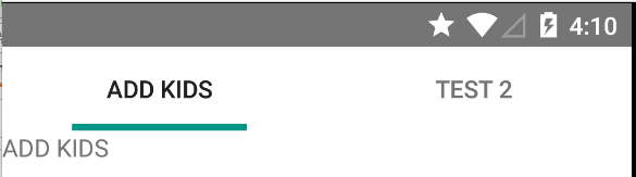
结果如下:enter image description here
这是我的代码:
+) 在.xml
<com.google.android.material.tabs.TabLayout
android:id="@+id/tabLayout"
android:layout_width="match_parent"
android:layout_height="wrap_content"
app:tabIndicatorColor="#D741C9EC"
app:tabIndicatorHeight="3dp"
app:tabSelectedTextColor="#D741C9EC"
app:tabIndicatorFullWidth="false"
app:layout_constraintBottom_toBottomOf="parent"
app:layout_constraintEnd_toEndOf="parent"
app:layout_constraintHorizontal_bias="0.0"
app:layout_constraintStart_toStartOf="parent"
app:layout_constraintTop_toTopOf="parent"
app:layout_constraintVertical_bias="0.0"
tools:ignore="MissingConstraints"></com.google.android.material.tabs.TabLayout>
+) 在适配器中:LoginAdapter.java
public class LoginAdapter extends FragmentPagerAdapter {
Context context;
int tab;
public LoginAdapter(@NonNull FragmentManager fm, Context context, int tab) {
super(fm);
this.context = context;
this.tab = tab;
}
public LoginAdapter(@NonNull FragmentManager fm, int behavior, Context context, int tab) {
super(fm, behavior);
this.context = context;
this.tab = tab;
}
@NonNull
@Override
public Fragment getItem(int position) {
switch (position){
case 0:
SignInFragment signInFragment = new SignInFragment();
return signInFragment;
case 1:
SignUpFragment signUpFragment = new SignUpFragment();
return signUpFragment;
default:
return null;
}
}
@Override
public int getCount() {
return tab;
}
@Nullable
@Override
public CharSequence getPageTitle(int position) {
switch (position) {
case 0:
return " Login ";
case 1:
return " Sign Up ";
}
return null;
}
}