Python 使用 Pandas 或 NumPy 滚动夏普比率
Python rolling Sharpe ratio with Pandas or NumPy
我正在尝试使用 Python 和 Pandas/NumPy.
生成 6 个月 滚动 夏普比率的图表
我的输入数据如下:
import pandas as pd
import numpy as np
import matplotlib.pyplot as plt
import seaborn as sns
sns.set_style("whitegrid")

# Generate sample data
d = pd.date_range(start='1/1/2008', end='12/1/2015')
df = pd.DataFrame(d, columns=['Date'])
df['returns'] = np.random.rand(d.size, 1)
df = df.set_index('Date')
print(df.head(20))

             returns
Date
2008-01-01  0.232794
2008-01-02  0.957157
2008-01-03  0.079939
2008-01-04  0.772999
2008-01-05  0.708377
2008-01-06  0.579662
2008-01-07  0.998632
2008-01-08  0.432605
2008-01-09  0.499041
2008-01-10  0.693420
2008-01-11  0.330222
2008-01-12  0.109280
2008-01-13  0.776309
2008-01-14  0.079325
2008-01-15  0.559206
2008-01-16  0.748133
2008-01-17  0.747319
2008-01-18  0.936322
2008-01-19  0.211246
2008-01-20  0.755340
我想要的
我要制作的情节类型是 this or the first plot from here(见下文)。
我的尝试
这是我使用的等式:
def my_rolling_sharpe(y):
    return np.sqrt(126) * (y.mean() / y.std()) # 21 days per month X 6 months = 126

# Calculate rolling Sharpe ratio
df['rs'] = calc_sharpe_ratio(df['returns'])

fig, ax = plt.subplots(figsize=(10, 3))
df['rs'].plot(style='-', lw=3, color='indianred', label='Sharpe')\
        .axhline(y = 0, color = "black", lw = 3)

plt.ylabel('Sharpe ratio')
plt.legend(loc='best')
plt.title('Rolling Sharpe ratio (6-month)')
fig.tight_layout()
plt.show()
问题是我得到了一条水平线,因为我的函数为夏普比率提供了一个值。该值对于所有日期都是相同的。在示例图中,它们似乎显示出许多比率。
问题
是否可以绘制一个 6 个月的滚动夏普比率,它每天都在变化?
使用 df.rolling 和 180 天的固定 window 大小的大致正确的解决方案:
df['rs'] = df['returns'].rolling('180d').apply(my_rolling_sharpe)
这个 window 不是正好 6 个日历月宽,因为 rolling 需要固定的 window 大小,所以尝试 window='6MS' (6 M onth Starts) 抛出 ValueError。
要计算 window 恰好 6 个日历月宽的夏普比率,我将复制 SO 用户 Mike:
df['rs2'] = [my_rolling_sharpe(df.loc[d - pd.offsets.DateOffset(months=6):d, 'returns'])
             for d in df.index]

# Compare the two windows
df.plot(y=['rs', 'rs2'], linewidth=0.5)
我已经为你的问题准备了一个替代解决方案,这个解决方案是基于仅使用 pandas 中的 window functions。
我在这里定义了 "on the fly" 夏普比率的计算,请为您的解决方案考虑以下参数:
- 我使用了 2%
的无风险利率
- 虚线只是滚动夏普比率的基准,值为1.6
所以代码如下
import pandas as pd
import numpy as np
import matplotlib.pyplot as plt
import seaborn as sns
sns.set_style("whitegrid")

# Generate sample data
d = pd.date_range(start='1/1/2008', end='12/1/2015')
df = pd.DataFrame(d, columns=['Date'])
df['returns'] = np.random.rand(d.size, 1)
df = df.set_index('Date')

df['rolling_SR'] = df.returns.rolling(180).apply(lambda x: (x.mean() - 0.02) / x.std(), raw = True)
df.fillna(0, inplace = True)
df[df['rolling_SR'] > 0].rolling_SR.plot(style='-', lw=3, color='orange',
                                         label='Sharpe', figsize = (10,7))\
                                         .axhline(y = 1.6, color = "blue", lw = 3,
                                                 linestyle = '--')

plt.ylabel('Sharpe ratio')
plt.legend(loc='best')
plt.title('Rolling Sharpe ratio (6-month)')
plt.show()

print('---------------------------------------------------------------')
print('In case you want to check the result data\n')
print(df.tail()) # I use tail, beacause of the size of your window.
你应该得到类似于这张图片的东西
我正在尝试使用 Python 和 Pandas/NumPy.
生成 6 个月 滚动 夏普比率的图表我的输入数据如下:
import pandas as pd
import numpy as np
import matplotlib.pyplot as plt
import seaborn as sns
sns.set_style("whitegrid")
# Generate sample data
d = pd.date_range(start='1/1/2008', end='12/1/2015')
df = pd.DataFrame(d, columns=['Date'])
df['returns'] = np.random.rand(d.size, 1)
df = df.set_index('Date')
print(df.head(20))
returns
Date
2008-01-01 0.232794
2008-01-02 0.957157
2008-01-03 0.079939
2008-01-04 0.772999
2008-01-05 0.708377
2008-01-06 0.579662
2008-01-07 0.998632
2008-01-08 0.432605
2008-01-09 0.499041
2008-01-10 0.693420
2008-01-11 0.330222
2008-01-12 0.109280
2008-01-13 0.776309
2008-01-14 0.079325
2008-01-15 0.559206
2008-01-16 0.748133
2008-01-17 0.747319
2008-01-18 0.936322
2008-01-19 0.211246
2008-01-20 0.755340
我想要的
我要制作的情节类型是 this or the first plot from here(见下文)。
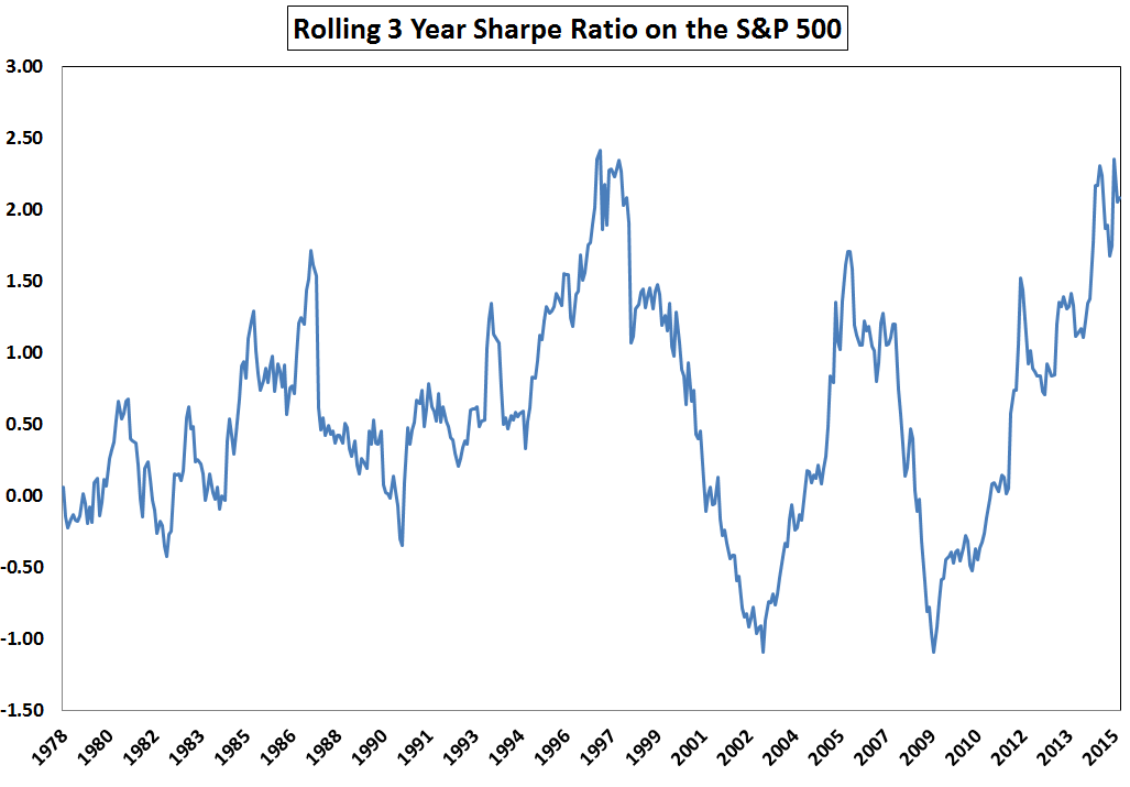
我的尝试
这是我使用的等式:
def my_rolling_sharpe(y):
return np.sqrt(126) * (y.mean() / y.std()) # 21 days per month X 6 months = 126
# Calculate rolling Sharpe ratio
df['rs'] = calc_sharpe_ratio(df['returns'])
fig, ax = plt.subplots(figsize=(10, 3))
df['rs'].plot(style='-', lw=3, color='indianred', label='Sharpe')\
.axhline(y = 0, color = "black", lw = 3)
plt.ylabel('Sharpe ratio')
plt.legend(loc='best')
plt.title('Rolling Sharpe ratio (6-month)')
fig.tight_layout()
plt.show()
问题是我得到了一条水平线,因为我的函数为夏普比率提供了一个值。该值对于所有日期都是相同的。在示例图中,它们似乎显示出许多比率。
问题
是否可以绘制一个 6 个月的滚动夏普比率,它每天都在变化?
使用 df.rolling 和 180 天的固定 window 大小的大致正确的解决方案:
df['rs'] = df['returns'].rolling('180d').apply(my_rolling_sharpe)
这个 window 不是正好 6 个日历月宽,因为 rolling 需要固定的 window 大小,所以尝试 window='6MS' (6 M onth Starts) 抛出 ValueError。
要计算 window 恰好 6 个日历月宽的夏普比率,我将复制
df['rs2'] = [my_rolling_sharpe(df.loc[d - pd.offsets.DateOffset(months=6):d, 'returns'])
for d in df.index]
# Compare the two windows
df.plot(y=['rs', 'rs2'], linewidth=0.5)
我已经为你的问题准备了一个替代解决方案,这个解决方案是基于仅使用 pandas 中的 window functions。
我在这里定义了 "on the fly" 夏普比率的计算,请为您的解决方案考虑以下参数:
- 我使用了 2% 的无风险利率
- 虚线只是滚动夏普比率的基准,值为1.6
所以代码如下
import pandas as pd
import numpy as np
import matplotlib.pyplot as plt
import seaborn as sns
sns.set_style("whitegrid")
# Generate sample data
d = pd.date_range(start='1/1/2008', end='12/1/2015')
df = pd.DataFrame(d, columns=['Date'])
df['returns'] = np.random.rand(d.size, 1)
df = df.set_index('Date')
df['rolling_SR'] = df.returns.rolling(180).apply(lambda x: (x.mean() - 0.02) / x.std(), raw = True)
df.fillna(0, inplace = True)
df[df['rolling_SR'] > 0].rolling_SR.plot(style='-', lw=3, color='orange',
label='Sharpe', figsize = (10,7))\
.axhline(y = 1.6, color = "blue", lw = 3,
linestyle = '--')
plt.ylabel('Sharpe ratio')
plt.legend(loc='best')
plt.title('Rolling Sharpe ratio (6-month)')
plt.show()
print('---------------------------------------------------------------')
print('In case you want to check the result data\n')
print(df.tail()) # I use tail, beacause of the size of your window.
你应该得到类似于这张图片的东西